EffectsNew
Glass Phone Duo
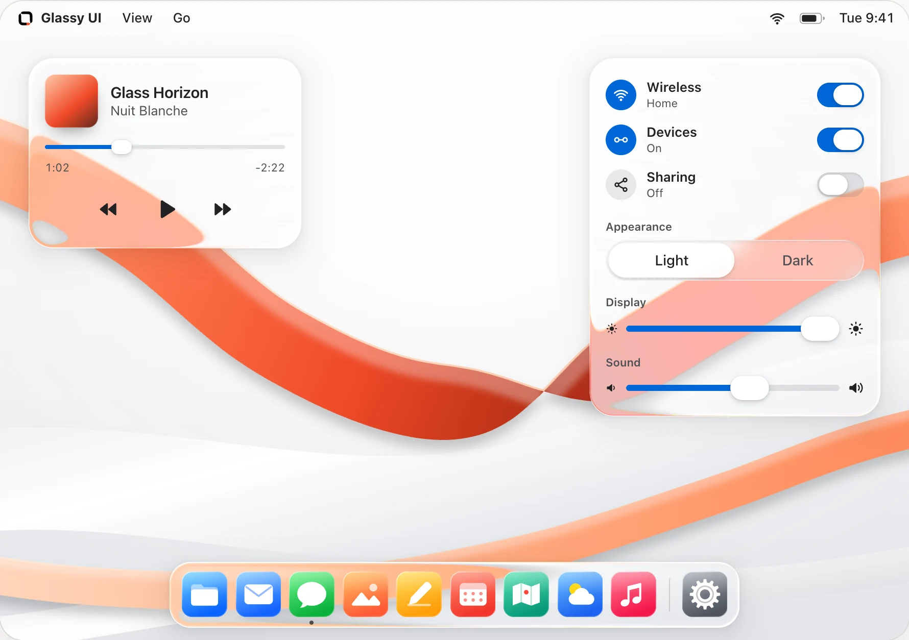
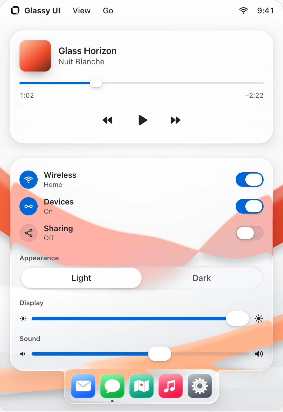
A folding glass phone with flat screen content, an outer display, and a smooth titanium frame.
pnpm dlx shadcn@4.14.1 add @glassyui/glass-phone-duoPreview
Demos ready. Update 0.
Installation
First add the exact @glassyui mapping to components.json as shown in Getting Started. Then run the pinned item command:
pnpm dlx shadcn@4.14.1 add @glassyui/glass-phone-duoWhat this installs3 files, 1 package
Direct registry declarations
These values belong to @glassyui/glass-phone-duo itself in registry.json.
Package dependencies
clsx
Registry dependencies
None declared.
File targets
components/glassyui/glass-phone-duo.tsxcomponents/glassyui/lib/phone-duo-renderer.tscomponents/glassyui/styles/phone-duo.css
Complete installed closure
This follows every namespaced registry dependency recursively and de-duplicates the packages and target files installed with this item.
Package dependencies
clsx
Installed files
components/glassyui/glass-phone-duo.tsxcomponents/glassyui/lib/phone-duo-renderer.tscomponents/glassyui/styles/phone-duo.css
Usage
import { GlassPhoneDuo } from "@/components/glassyui/glass-phone-duo";

export function Showcase() {
  return (
    <GlassPhoneDuo
      className="w-full max-w-2xl"
      screenSrc="/app-landscape.png"
      screenAlt="The app on the unfolded display"
      coverSrc="/app-portrait.png"
      coverAlt="The app on the cover display"
    />
  );
}
Examples
const [open, setOpen] = useState(true);

return (
  <>
    <GlassPhoneDuo
      open={open}
      finish="star-white"
      screenSrc="/app-landscape.png"
      coverSrc="/app-portrait.png"
    />
    <button type="button" onClick={() => setOpen(!open)}>
      {open ? 'Close phone' : 'Open phone'}
    </button>
  </>
);<GlassPhoneDuo
angle={120}
view="back"
finish="night-sky"
screenSrc="/app-landscape.png"
coverSrc="/app-portrait.png"
/>API
GlassPhoneDuoForward-ref figure containing the WebGL 2 device.
screenSrcOne landscape screenshot for the entire inner OLED. Required; use a 2670:1878 aspect ratio.
coverSrcPortrait screenshot for the outer display. Required; use a 1398:2034 aspect ratio.
screenAlt / coverAltAccessible descriptions of the screenshots. Only the displayed side is announced.
openAnimates the hinge open or closed. Defaults to true.
angleManual hinge angle from 0 (closed) to 180 (flat). Overrides open and skips animation for scrubbing.
finishnight-sky or star-white. Defaults to night-sky.
viewfront or back. Turning over exposes the horizontal rear cameras. Defaults to front.
glareA faint reflection across the displays. Defaults to true.
Notes
Screen captures
The screenshot stays on a flat plane while the glass lifts, blurs, and dims above it, just like the website intro. The outer display uses its own capture. Use same-origin or CORS-enabled images. The mockup requires WebGL 2.
Geometry
The body follows the iPhone Duo specifications: 164.6 × 117.8 × 5.2 mm open and 84.1 × 117.8 × 11.3 mm closed. Display proportions follow the specified pixel ratios. Corner radii, camera housing, buttons, and reflections are approximated from Apple’s official product renders.
Accessibility
System and site reduced motion put the hinge and view directly at their destination. Reduced transparency removes reflections. The two displays share one accessible description.
Accessibility
Keep the Radix-backed semantics intact and preserve visible labels, focus states, and keyboard operation when copying the source.
Performance
Use provider quality preferences for dense app screens. Reserve strong refraction for hero or showcase surfaces.