Guide
Make a shadcn/ui app glassy with one command
Install the Glassy UI theme for shadcn/ui: the components you already use turn to lit, tinted glass in your own colours, with no code changes.
Install it
The Glassy UI theme restyles the stock shadcn/ui components your app already has. Run one command in a shadcn/ui app on Tailwind CSS 4:
pnpm dlx shadcn@4.14.1 add https://glassyui.com/r/glassy-theme.jsonIf your components.json already maps @glassyui (see the shadcn guide), the item is also @glassyui/glassy-theme. The command was tested with shadcn CLI 4.14.1 and 4.21.0.
The command writes CSS only. It adds --glassy-* tokens next to your palette, two easing curves to @theme inline and one @layer glassy block inside @layer components. No component file changes. Every tint comes from your own colours: a black --primary gives black glass, a blue one blue glass.
What it looks like
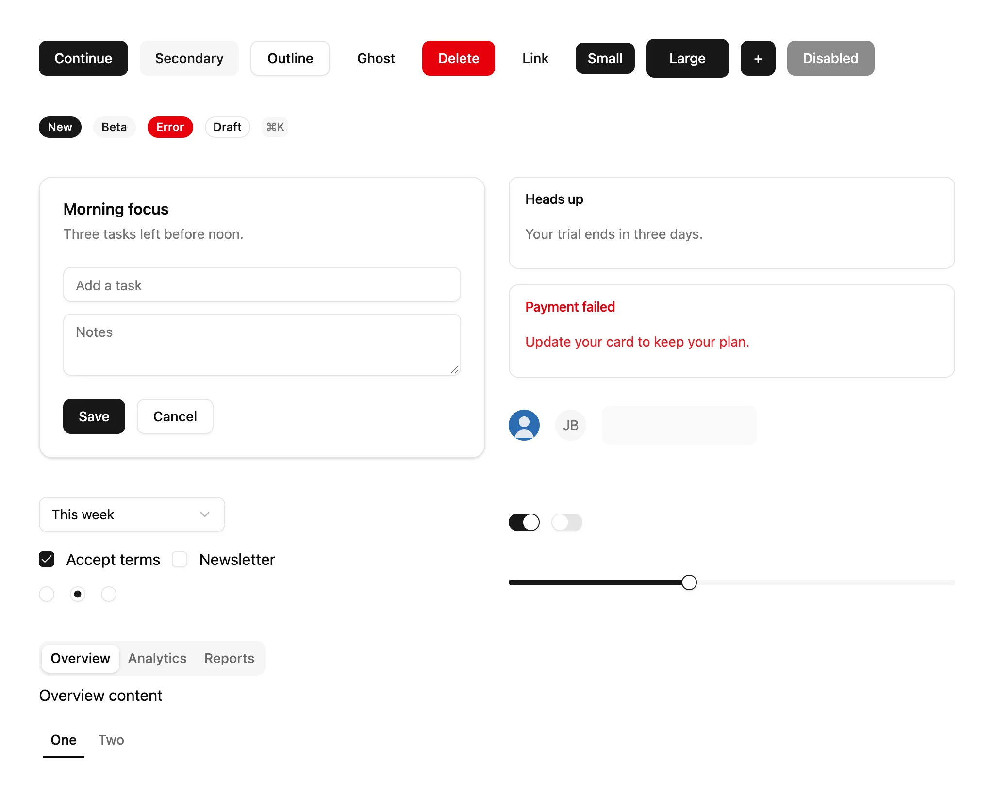
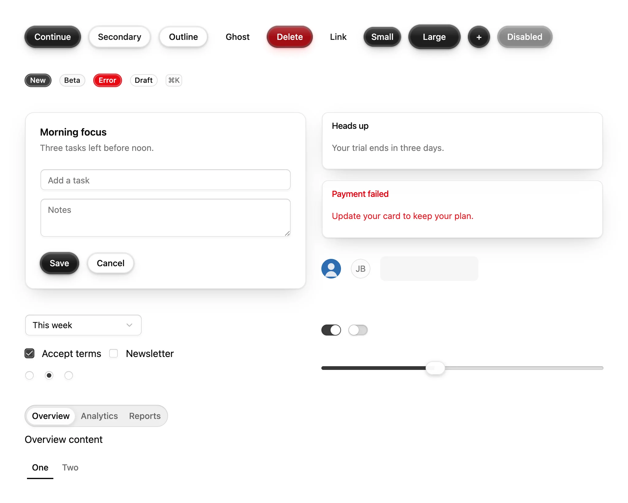
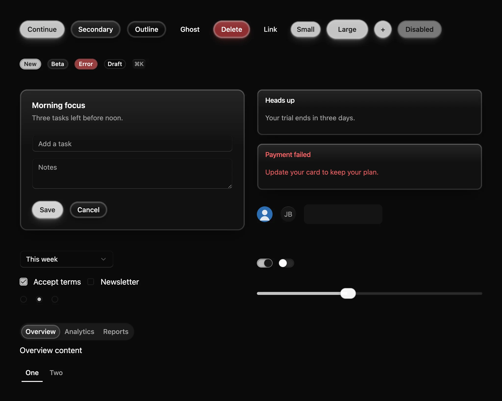
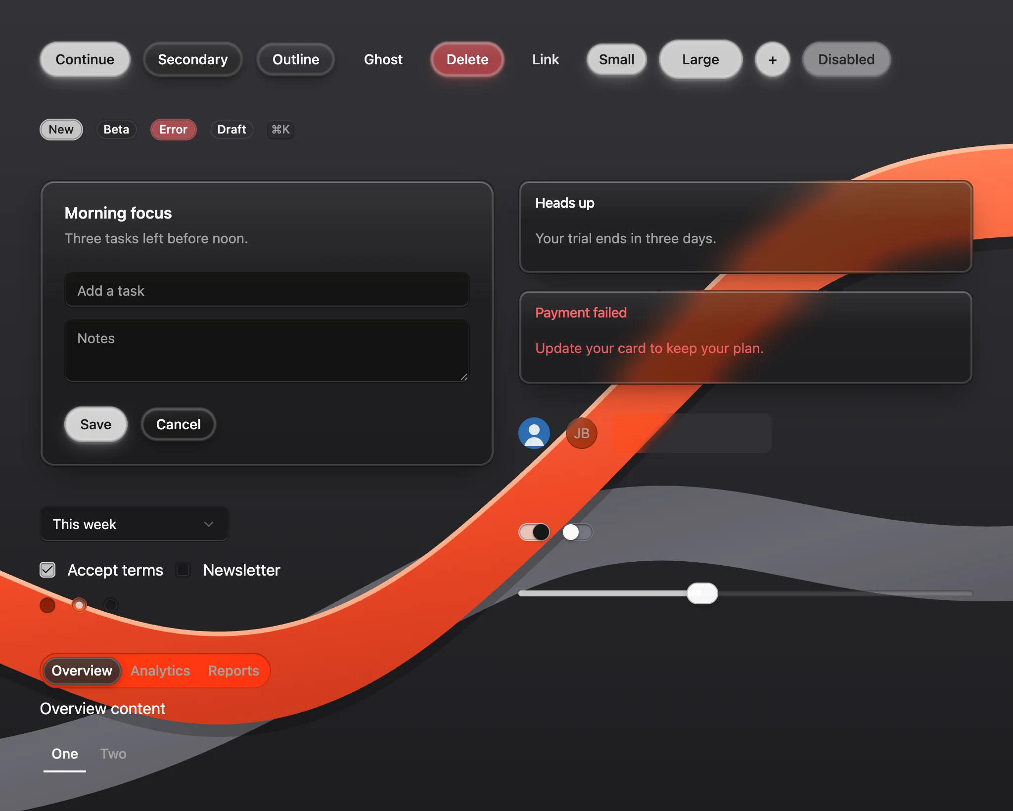
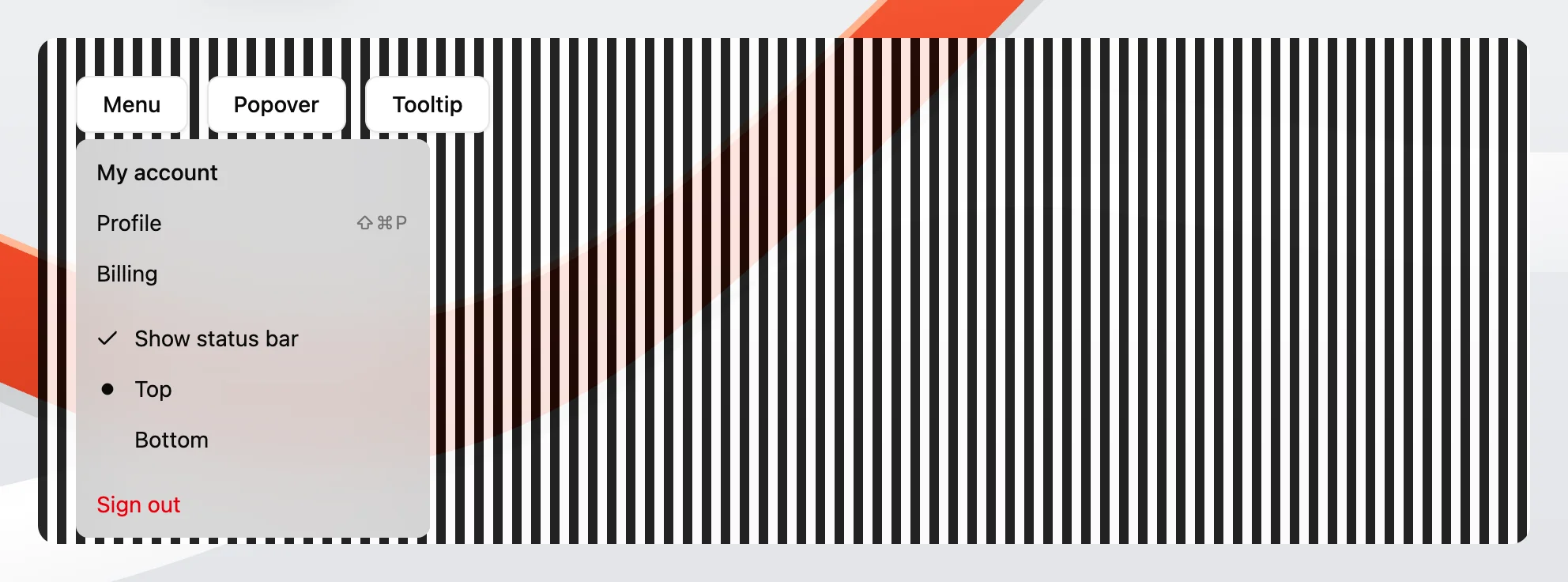
Buttons rest like slabs of glass just above the page. A pointer lowers one and a press sets it down, so its shadow draws in; nothing scales. Cards and alerts frost what lies behind them and light their rims. Inputs, textareas and select triggers become recessed wells. Switches and sliders get glass knobs that spring. The selected tab sits on a pill of glass that slides to the tab you pick.
Which components change
Button, badge, card, alert, kbd, skeleton, avatar, input, textarea, select, dropdown menu, popover, tooltip, dialog, sheet, command, tabs, switch, slider, checkbox and radio group. They were tested in Chrome on two stock apps: new-york on Radix, and base-nova on Base UI. Other styles use the same slots but are untested.
Everything else keeps its stock look, including accordion, context menu, menubar, navigation menu, hover card, sidebar, drawer, toggle group, progress and toasts. The theme tells button variants apart by their data-variant attribute, or by their stock classes on base-nova, so a button whose variant classes you rewrote may keep its stock look.
Tune it
Raise the tint when glass sits over a busy image, or lower it for clearer glass. Put the tokens in :root for light mode and .dark for dark mode:
:root {
  --glassy-tint: 90%;    /* tinted buttons, badges and checked controls */
  --glassy-surface: 72%; /* cards, menus, popovers and dialogs */
}
The other tokens set the blur (--glassy-frost, and --glassy-float-frost for menus, popovers, selects, dialogs and sheets), the colour boost behind it (--glassy-saturate), the field fill (--glassy-field), rim light and shade (--glassy-rim, --glassy-shade), the sheen across glass faces (--glassy-sheen), the shadow colour as an r g b triplet (--glassy-shadow), how far tinted buttons deepen their colour (--glassy-tint-depth) and how far the selected tab’s pill leans toward your text colour (--glassy-pill-lift).
Your classes still win
The theme sits below Tailwind’s utilities, so a class you write on a component keeps winning, as it did before. Fields draw their fill as a background image and their rim as an inset shadow, so clear those first when you restyle one:
<Input className="bg-none bg-amber-50" />       {/* your own field colour */}
<Input className="inset-shadow-none" />          {/* no recessed rim */}
<Card className="bg-white" />                    {/* your own card colour */}
Accessibility
With Reduce Motion on, the themed components and accordions stop sliding, springing and fading, the stock open and close animations included; each one lands in its end state. With Reduce Transparency, Increase Contrast or a forced-colours mode on, the glass turns into solid fills in your palette with plain borders; forced colours use your system colours.
On plain light and dark pages with the default palette, labels on glass buttons, badges, tabs, keys, cards, alerts and menus keep at least 4.5:1 contrast, measured from the rendered pixels in Chrome. Disabled buttons, which WCAG exempts, are the exception. Where shadcn/ui’s own colours already fall short, as base-nova’s soft destructive button and badge do at about 3.8:1, the theme keeps their contrast. Over a photo or illustration, contrast depends on the image: raise --glassy-tint and --glassy-surface until your labels read clearly.
Remove or upgrade it
Delete the @layer glassy block, the --glassy-* lines in :root and .dark, and the --ease-glassy-* lines in @theme inline. To upgrade, remove them first, then run the install command again: the shadcn CLI adds and updates rules but never deletes old ones.
What needs Glassy UI’s components
A theme is CSS only. It cannot measure each element, follow a pointer or keep momentum, so these stay with Glassy UI’s own components: refraction that bends the backdrop at the rim, a glow that lands where you press, a bubble you can drag between segments, and springs that keep their speed when you change direction mid-move.